BlackKnightController started as a practical lab controller: power hosts on, PXE boot them, ship scripts, validate services, and keep the operator from retyping the same fragile commands.
The recent lab work pushed it into a more interesting shape.
It is becoming a company mind: a place where infrastructure actions, resource relationships, pipeline intent, latest run evidence, screenshots, local model explanations, and editable diagrams live close enough together that a human can trust the story.
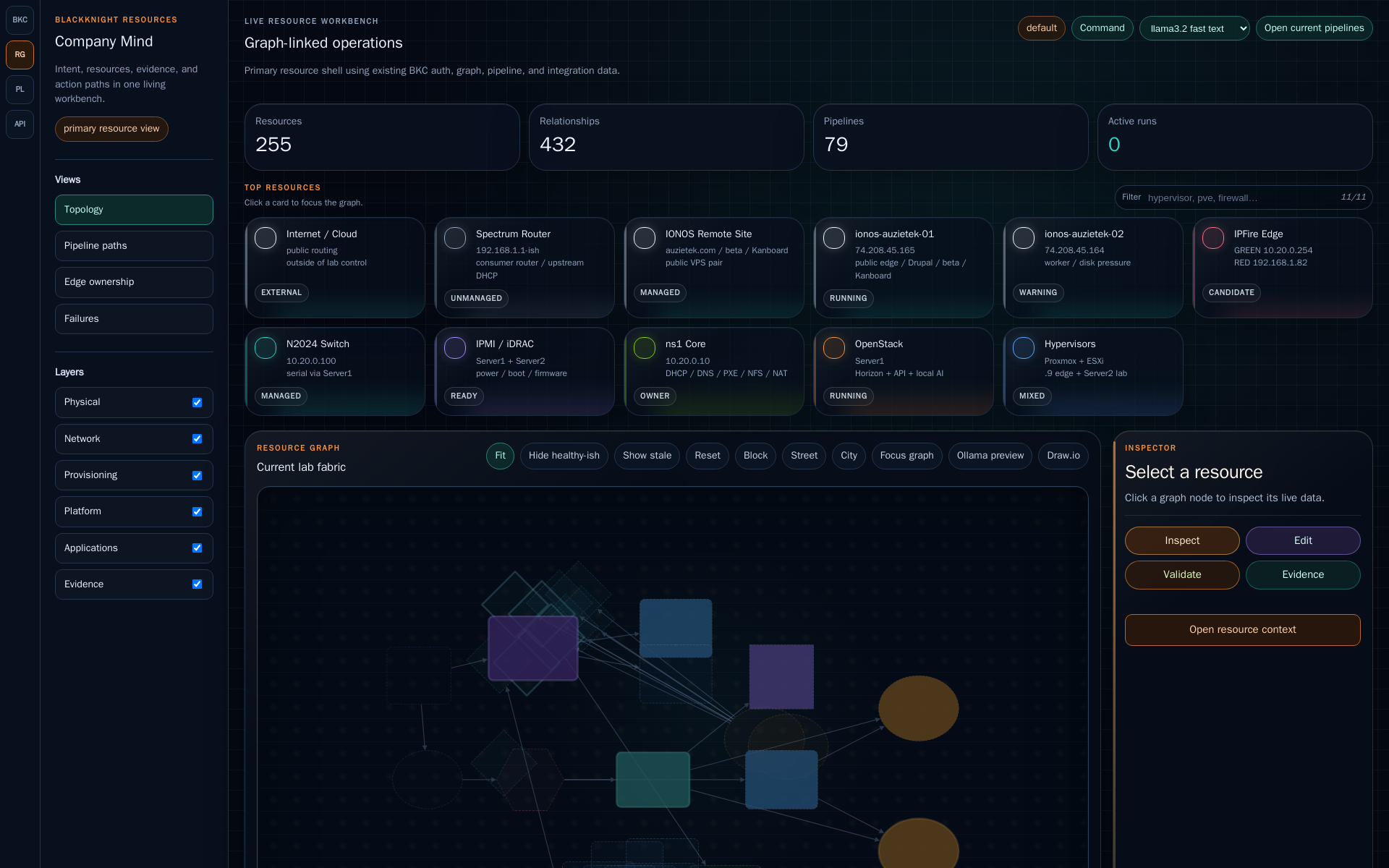
The loop that matters
The core operating loop is still deliberately simple:
operator intent
  -> BKC pipeline
  -> real action
  -> validation
  -> evidence
  -> explanation
  -> reusable fragment
That last part is the difference between a clever demo and a maintainable system. If the evidence does not land back near the pipeline, the next run starts from memory and hope. If the evidence becomes a fragment, the next run starts from a known-good pattern.
Pipelines are not magic
A BKC pipeline is not supposed to be mystical. It should be boring in the best way:
- what target it touches;
- which transport it uses;
- what risk level the step carries;
- what inputs must exist;
- what proof says the step worked;
- what fragment should be preserved for the next operator.
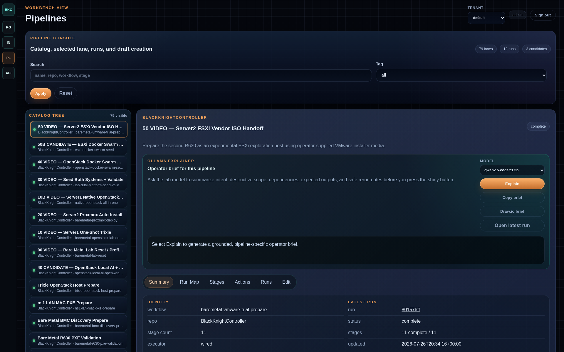
The pipeline cockpit now has enough structure to support an operator brief. A local Ollama model can summarize what a pipeline is intended to do, what is risky, what should be ready before running, and what proof should exist after. BKC still owns the action boundary. The model helps explain the terrain.
Local models belong near the lab
The Ollama worker is intentionally local. That choice is not only about privacy, although privacy matters. It is also about latency, survivability, and context. If the lab is rebuilding hosts, shifting DNS, or testing an internal route, the assistant that explains the state should be able to see the same grounded evidence the operator sees.
In the current pass, BKC can ask a local model for several small but useful jobs:
- explain a pipeline in operator language;
- summarize the latest run instead of dumping raw logs;
- suggest a first-pass graph layout;
- produce a Draw.io-friendly scene that a human can edit;
- help turn field evidence into article, runbook, or training material.
This is not presented as finished magic. The model output still needs review. The value is that a rough explanation appears close to the button, close to the run, and close to the evidence.
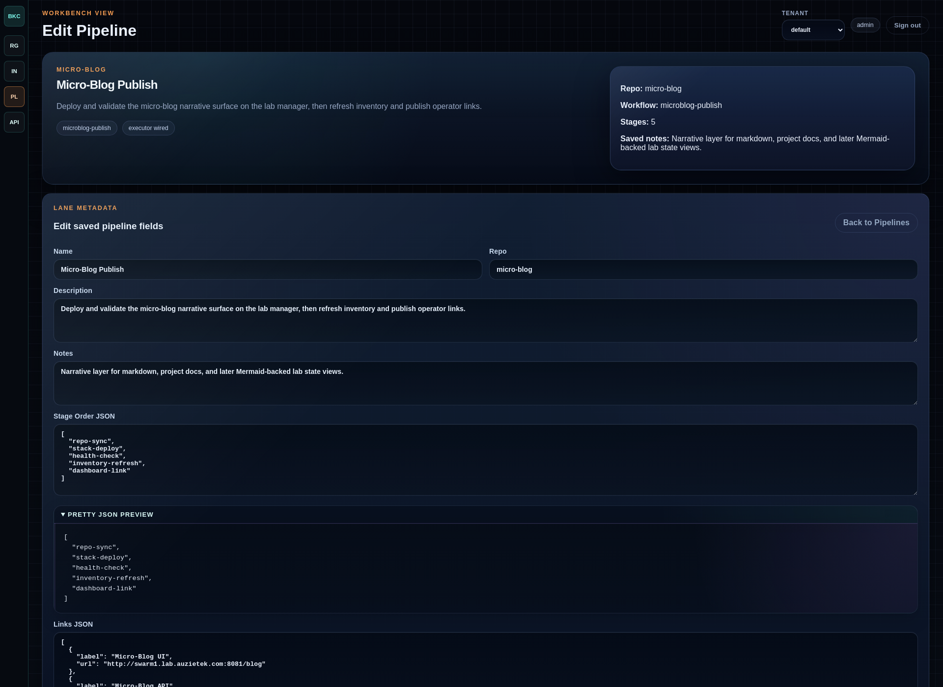
The detail view is where a pipeline stops being a label and becomes something an engineer can audit. Stage definitions, JSON fragments, shell snippets, notes, and run intent should be readable enough that the operator can review the plan before pushing the button.
The same thinking applies to the graph buttons. A graph should not trap the operator in a tiny widget. The useful actions are becoming explicit:
- zoom to the graph when the relationship view is the work;
- ask Ollama for a layout when the graph gets too dense;
- export Draw.io when the current state should become documentation;
- open the related resource, pipeline, latest run, or evidence fragment.
Those buttons are small, but they mark an important product direction: BKC is not only showing data. It is helping the operator turn data into the next safe action.
Latest runs should teach too
The next useful step is not only explaining the plan. It is explaining what actually happened.
A latest-run view can expose:
- which stages ran;
- which stages waited, failed, or were skipped;
- what validation evidence was captured;
- what the operator should inspect next;
- whether a safe rerun is appropriate.
That turns a run history from an audit trail into a teaching surface.
pipeline definition answers: what should happen?
latest run evidence answers: what did happen?
fragments answer: what should we remember?
Draw.io as portable evidence
The Draw.io export matters because it turns operational state into an artifact people can carry into documentation, review, training, or a meeting.

The first diagrams are not final poster art. They are editable evidence. A pipeline explainer can become a diagram. A latest run can become a stage map. A resource graph can become a picture of the current lab fabric.
That gives an engineer a clean handoff:
BKC view -> generated diagram -> human polish -> docs / article / video
The pipeline explainer already follows that path. BKC can generate a Draw.io
scene from a pipeline definition, open it in a normal editor, and let the human
make the first cleanup pass. That matters because the artifact does not end as a
flat screenshot. The screenshot is proof for the article; the .drawio file is
the thing an engineer can keep editing.
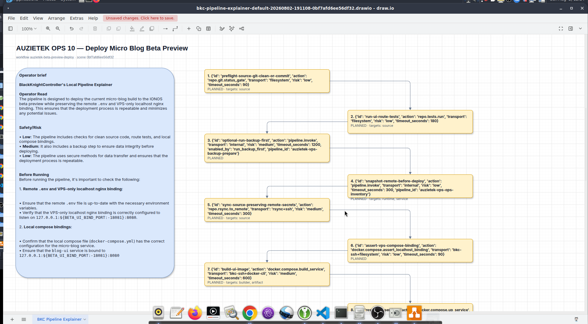
This is still an early pass: spacing, font binding, lane grouping, and visual hierarchy can all improve. But the important product behavior is already there: a pipeline can explain itself, become a diagram, and then become reviewable documentation.
Here is a first-pass example from the IONOS and lab-edge work. It is not meant to be a final architecture poster. It is a proof that BKC can take inventory, relationships, operator notes, and model guidance, then produce an editable artifact instead of another disposable chat answer.
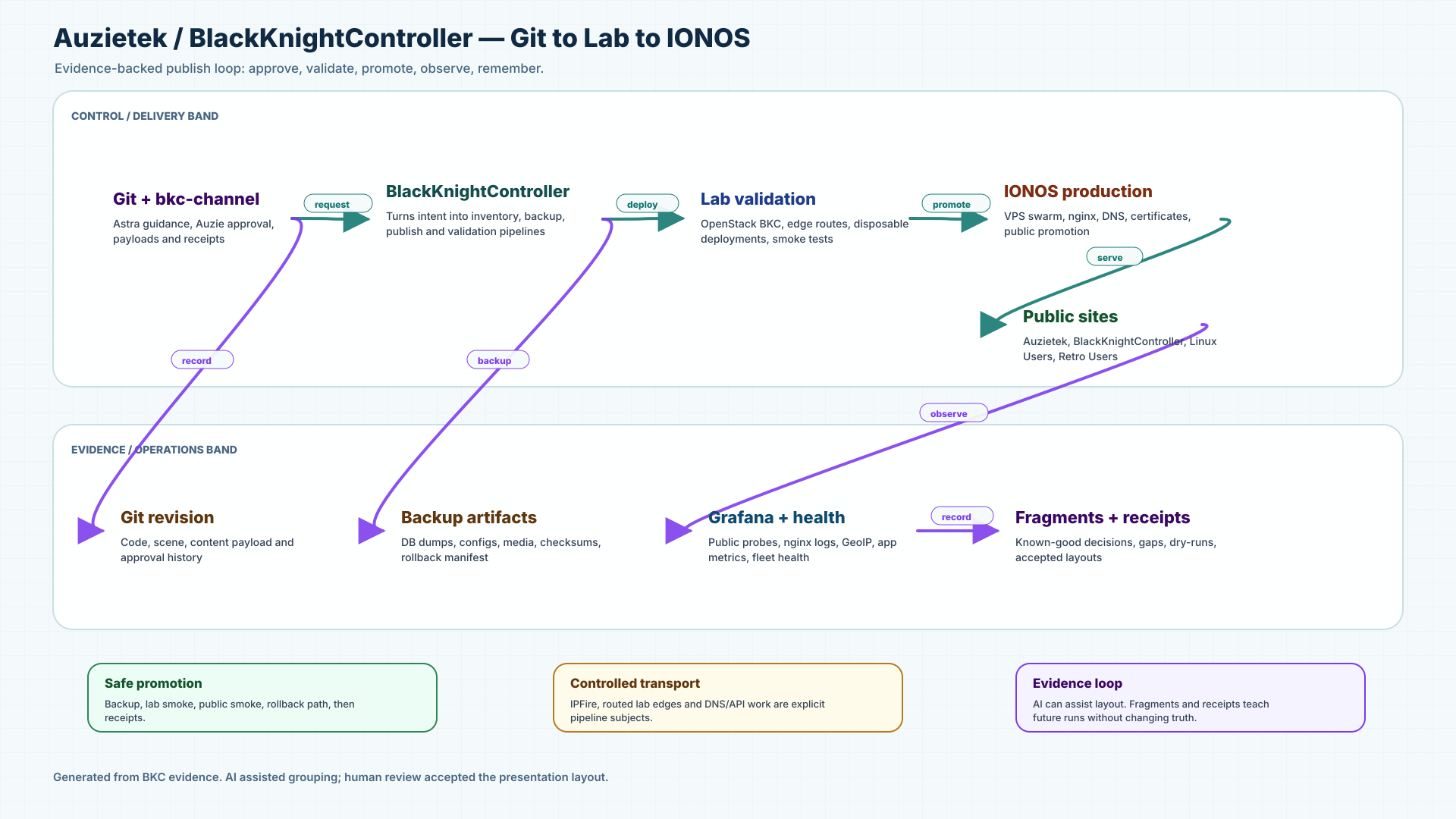
The paired Draw.io source is preserved as an artifact too: download the editable diagram.
The model-side layout summary looked roughly like this:
Diagram for Auzietek and BlackKnightController lab edge, public IONOS site,
BKC control loop, backup/maintenance lanes, and telemetry path.

Lane order:
operator -> lab -> ionos -> public -> evidence

Important emphasis:
human/Astra/Codex approvals flow through bkc-channel;
BKC talks to lab DNS, edge services, IONOS inventory, backup, and telemetry;
public visitors resolve DNS, hit nginx, and feed public dashboard evidence.
Why the graph changed the story
The resource graph started as an inventory visualization. It is growing into a workbench for operational relationships:
- edge services;
- switches and firewalls;
- hypervisors;
- OpenStack and ESXi swarms;
- public IONOS sites;
- DNS and certificates;
- pipelines that affect each layer.
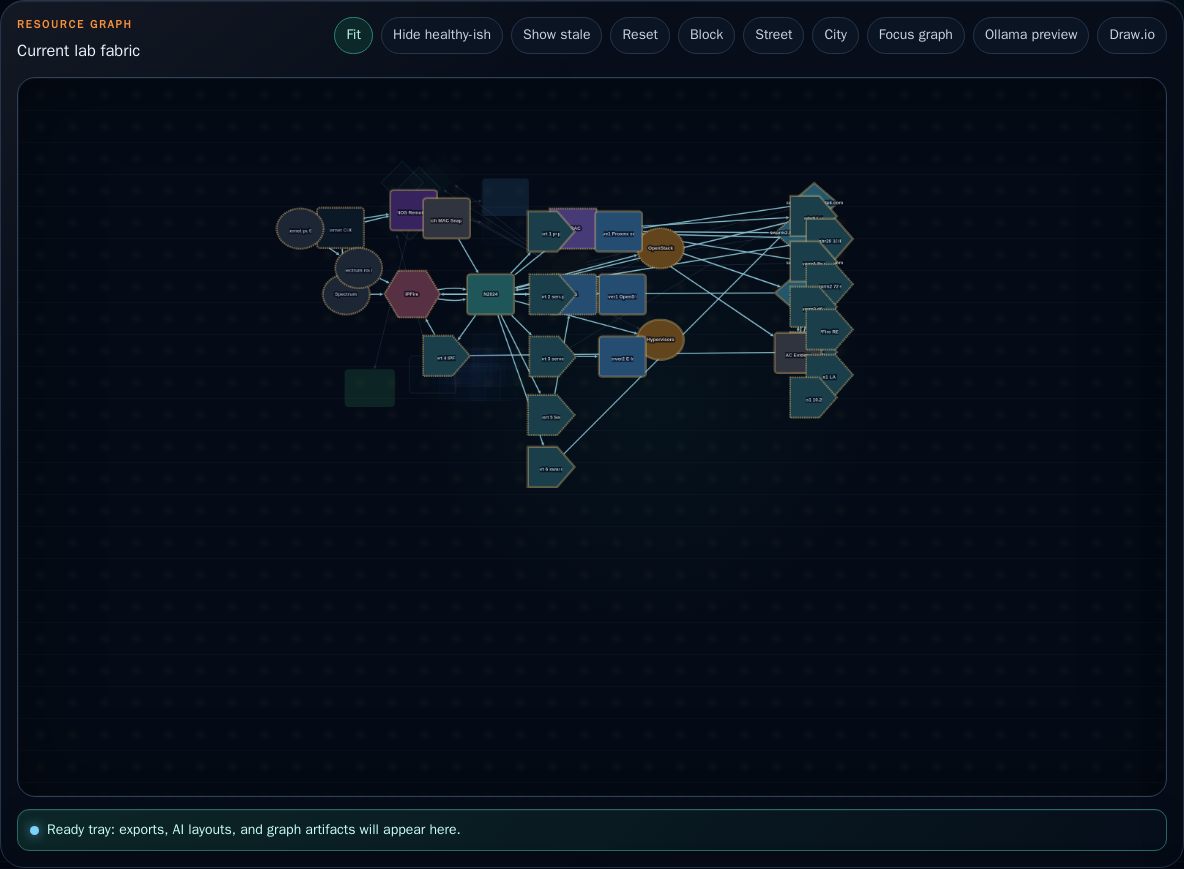
That is why layout matters. If a graph is only a cloud of nodes, it is decoration. If it shows ownership, edge paths, health, stale resources, and the pipeline that created or repaired a thing, it becomes a decision surface.
The human remains the authority
This is not a “let the AI run the company” story.
The stronger model is human-led:
- Auzie sets intent and approves direction.
- Codex implements, validates, deploys, and records receipts.
- Astra reviews content, story, and visual guidance through the private channel.
- Ollama provides local explanation and layout assistance where it helps.
- BKC owns actions, permissions, evidence, and repeatability.
The assistant is useful because the tool boundaries are clean. The pipeline is useful because the evidence is real. The graph is useful because it points back to live resources instead of pretending to be a static drawing.
That is the Company Mind direction: not infrastructure as a pile of tools, but infrastructure as a living operational story a human can inspect, question, rerun, and teach.